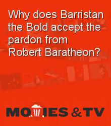
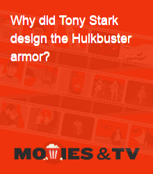
Indeed. This seems to be a general problem with all the sites that recently got the HNQ ads (after having been forgotten previously) and seems to be due to the use of some kind of default font color instead of font colors tailored to the site's actual color palette. It is already adressed in this related question for Chemistry.SE's ad.
The font colors should rather be oriented towards our site's own color palette ( ) as originally presented (maybe using the light color for the font and the dark color for the shadow or the other way around, upto the designers' discretion). Along with similar issues about the actual background image, as adressed in this related bug report, a possible solution to those problems might look similar to this (only a possiblity):

UDPATE 2015-09-15: The font color seems to have been fixed to some degree into plain white, which makes it less agressively fighting with the background (that has been fixed, too) and improves readability.

However, I'd still not consider this solved yet, since the current plain white text and the very bold and blurry font is still quite hard on the eyes. But as a comment on the respective main meta version of this question points out, this might already by fixed by removing the white drop shadow that still seems to be there on the white text.
UDPATE 2015-09-22: So, the problems with the thick font/white drop shadow seem to have been solved now, too. With those changes I'd consider all the problems with our HNQ ad solved now:


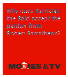
 )
) 