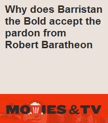
We finally seemed to have gotten HNQ advertizements for our site. Those advertize selected Hot Network Questions from our site on other sites, using the 220x250 community ad slots that each site has. This is done by overlaying a base image with the respective question text. An example for this would be this ad, based on this base image:
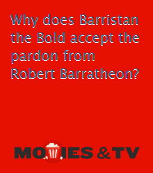
(As you can see, there is a severe problem with the font color of the question text. However, this is not the subject of this bug report and is already adressed in a similar question on the main meta and a recent question on our meta and seems to be some kind of default font color instead of one adapted to the site design.)
But for now I am more concerned about the base image itself, which seems rather inappropriate when compared to our site design as well as the HNQ ads of other sites. There are various problems I'm going to list in decreasing order of importance:
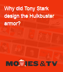
The color scheme itself is significantly different from our site's color scheme as presented in the original site design and as used in the top-bar of the site as well as any other place involving the site's characteristic orange-red. It thus fails to appropriate represent our site's brand. For comparison, here it is (left) next to the site color (right):


It is significantly less "exciting" than many other sites' base images. It only has the logo inside a completely plain background. If you look at some other sites' ad images (as listed here or the currently running ads here), you can see them usually include various design elements, be it only just some faint background imagery that already helps to lighten up the plain-colored wall.
The image seems to suffer from significant compression issues as visible on the logo. Using a PNG image instead of JPG seems to be an option for HNQ base images as demonstrated here. So this might be solved this way.




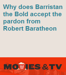
 for the font and shadow respectively, this would look similar to this:
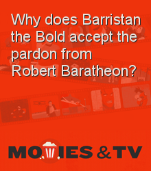
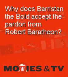



.pnginstead of.jpg).